We aim to help young adults expand their social network and reinforce their passion for music by creating a streamlined social app based on music interests, so these young adults can build interpersonal connections.
Role — UX Researcher and UX/UI Designer
Time — 7 weeks
Team — Katrina Do, Diana Nguyen, Helen Zhao
Background
Popular social media platforms allow users to have conversations about almost any topic any time they want, but this extensive degree of openness makes specific conversations get hard to find as they get lost in all the noise. On Twitter, one can share absolutely anything, but keeping focused conversations is difficult when such a wide variety of topics exist in one place. A Reddit user might enjoy some focused conversation via communities, but it is difficult to share music without having to link and listen on another platform or webpage. Many young people want to be able to share music with those that want to hear it, but these awkward barriers make it hard to have conversations and organically connect with people who have the same passions.
User Research
Competitive Analysis
We searched the internet high and low for all types of platforms where users stream and share music. Ultimately, we found that each platform we found only focused on one of three aspects of the music experience.
Listening to Music
Spotify: users can create playlists individually or with a group and share it with others.
Soundcloud: allows producers to post their music creations, share songs, and even leave a comment on a song.
Facebook: has group pages where users can buy and resell tickets for upcoming events, but found that there is a lack of a security feature.
Connecting with Music-Lovers
Tinder: has “festival mode” where users could make connections with others ahead of time before a festival or concert and could talk about the music or just make friends with a common music artist/genre interest. This is only a specific feature of the dating app, so the app itself is not music-centric.
Sharing Music
Bopdrop and Lishash: are very small and new apps on the market prioritizing music sharing on a home page feed but with limited features
Reddit: subreddits such as r/ifyoulikeblank where users can give personalized recommendations on any topic (books, music, movies) based on the original poster’s request.
MusicBoard, Vampr, We Should Write Sometime, Album of the Year, and Weverse: allow users to connect with others to share their favorite songs, music recommendations, find people to produce music with, etc.
User Interviews
We also decided to focus our research and app development on users our age (18-25) given that they are more likely to download a social media app. (In this case, we also had to consider scope and timeline, as we had limited time to find people of other demographics.)
We spoke with 4 interviewees, and asked about their music-listening habits, how they share music, how they connect with others via social media, experience attending concerts/festivals, their likes & dislikes on current apps, and other opinions on music communities.
Overall Findings
Overall, the scope of our research on the topic of music unveiled the common experiences in receiving and sharing song and artist recommendations, using platforms to buy tickets to upcoming events, artists forming connections with each other (as well as connections between artists and fans), and fellow fans connecting with other users to discuss music-related content.
We used an affinity diagram to organize our thoughts and create personas for our users. Finally, we understood their main problems:
Music-lovers want to make new friends with similar music taste.
It’s hard to find anyone to go to a concert with.
Song recommendations on streaming apps aren’t what users want.
Echo-chambers prevent people from having unbiased opinions on artists/events.
Some producers don’t get enough exposure to acquire fans.
Producers aren’t able to release songs to fans .
Problem
Music-loving young adults need online spaces that not only allow them to talk about music, but also to connect with others that have the same passions, find information about events, and share their own music for discovery.
Solution
We aim to help young adults expand their social network and reinforce their passion for music by creating a streamlined social app based on music interests. This way music-lovers can build interpersonal connections and share their music to other people who will listen.
Design Process
Through the use of problem/solution brainstorming, user scenarios and storyboards, we were able to use what we know about our potential users and their pain points to create features of an app that would help them enjoy music to the fullest.
Features & Functionality
Our brainstorming led us to create an app with the following features:
Discover: A feed where anyone can post and comment on songs, albums, playlists, and events.
Listening: Tap on a song from a post or discover page to listen to it while you scroll
Events: An event calendar & live event map that shows upcoming events, who is going, event logistics, and where friends are live at the event.
Profiles: Shows all of a user’s posts and likes, what they are currently listening to, entry to DMs, their following/followers, their music uploads (for artists). An official public artist profile shows all of their songs, albums, events, and posts.
Branding
energetic
exploratory
electric
comfortable
music
community
lively
collaborate
inviting
share
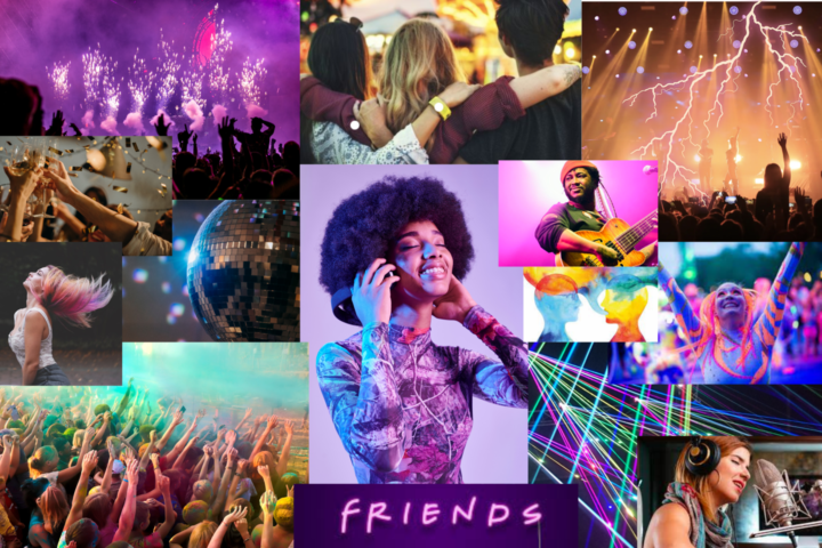
These adjectives express values and moods that shape the branding for the app. The goals of our visual design were to allow users to:
- feel comfortable and safe as they are surrounded by friends when using the app,
- be energetic and innovative as they share and create,
- and feel invited so they can connect with others and become friends over shared interests.
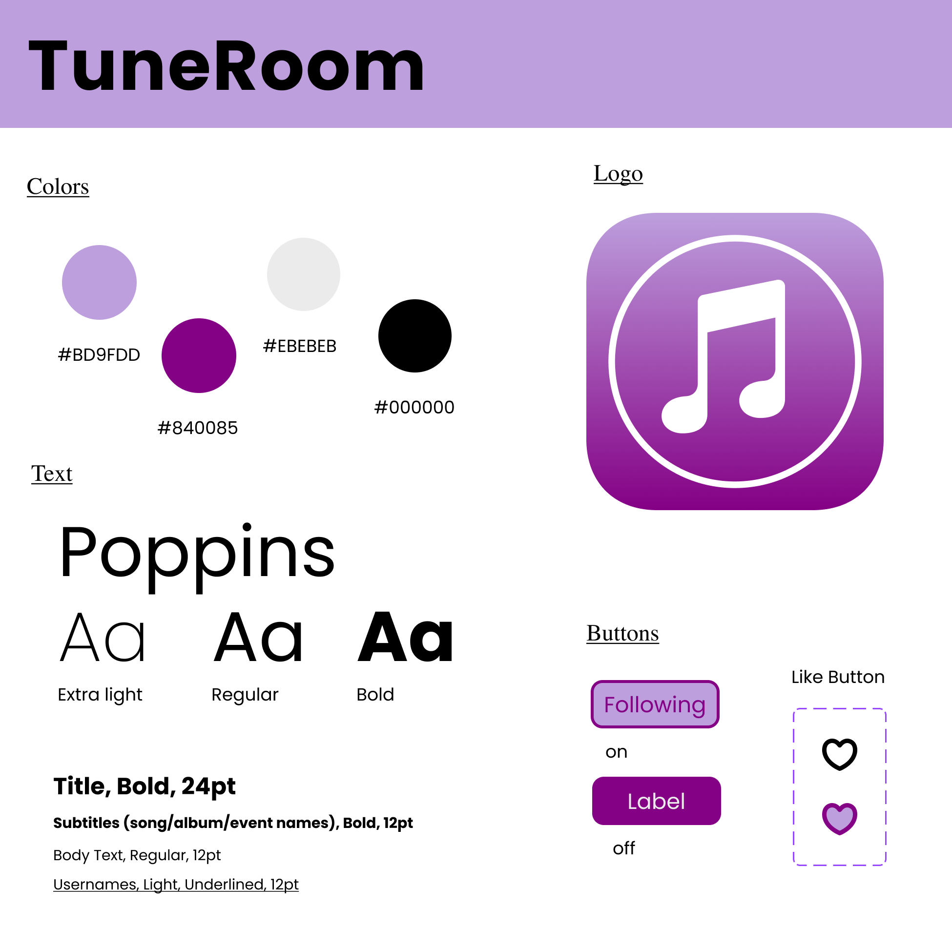
We then created a UI kit that reflects the brand adjectives and goals. Ultimately, we decided on the name TuneRoom as out app gathers people from all over to share their thoughts and listen to music all in one place.
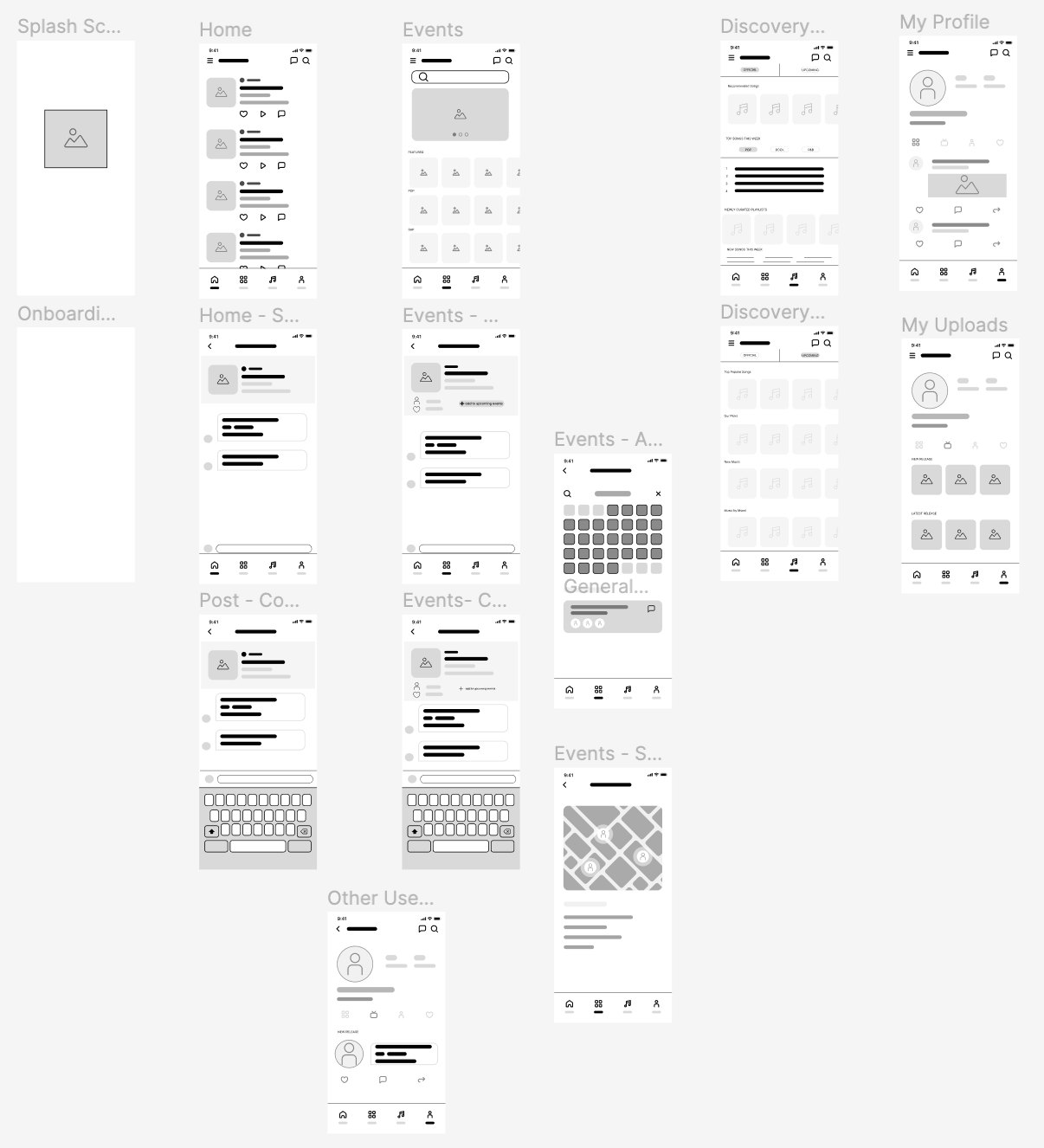
Lo-fi to Hi-fi
Two Rounds of User Testing
After testing both our lo-fi and hi-fi designs with 5 users each, we made a few improvements that made the app easier to use and more enjoyable to experience.
- One interviewee commented that they felt like that home page was too cluttered. Another mentioned feeling overwhelmed by the presentation of the content.
FIX: We made the sizes of the icons smaller and changed text spacing on posts to allow for more white space that lends to easier reading. - A user mentioned that the “uploads” icon on the profile page was misleading because it looked like a TV
FIX: Changed the icon for uploads to a common upload symbol to make it more intuitive for users - An interviewee claimed that the “Events” menu tab was not easily recognizable as it didn’t relate to events.
FIX: Upon review, we then noticed that it was the same icon as the “Posts” tab on the profile page, so we replaced it with a calendar icon. - Though the chat button was available, we had not fully prototyped the chat experience, so users were left feeling as if they were missing out on some of the social aspect of the app.
FIX: Made our chat function more high fidelity in order to show users the experience of connecting one-on-one with another music lover. - Interviewee mentioned wanting an artist profile page to stay up to date with artists as they post news and new music.
FIX: Added profile pages specific to popular artists to contain all of their media and posts in one place.
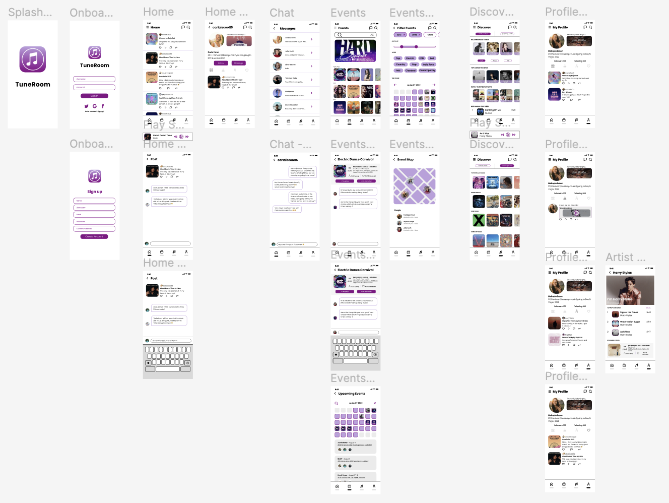
Overall, users were generally pleased by the concept and design.
- Mentions of the app being “cool” and “cute,”
- Very easy to use since it is “pretty straightforward”
- Reminiscent of a “music social media app”
Future Features & Improvements
After all our hi-fi prototype was said and done, we still had ideas for how to improve our app. (Many were inspired by comments from the users we interviewed and tested with.)
Given more time and resources, we’d add a “create playlist” feature so users can collaborate and share with friends, allow users to see their followers/friends current listenings and history, add more event filters like event size or events that friends are interested in, and ultimately making the app higer fidelity by fully prototyping “create post” and “upload music” pages.
Final Prototype
Click here to view our Figma Prototype.

Learning Outcomes
For an app with many types of media (music, text, album covers, etc), it is easy for a user to get lost or overwhelmed. Balancing the fact that the app had to be interesting to be competitive (make visuals fun and aesthetically pleasing & include all forms of media necessary for sharing music) with the fact all of this media was difficult and required many iterations and rounds of user testing to get right. Only after listening to our users, did we understand the value narrowing down on focal points and understanding hierarchy in order to help them focus on certain types of media having to omit others.
Ultimately, it important to find the perfect balance of having everything the user needs on the screen while also remaining usable, so users can actually enjoy their time on the app. A designer can’t do this without understanding their users’ goals and experiences.
Thanks to Professor Kevin Popovic, and my teammates, Katrina Do, Diana Nguyen & Helen Zhao.
