Over 10 weeks, our team worked with dentist, Dr. Claudia Florescu, to understand her clients’ needs as well as the needs of the business in order to create a website redesign that is trustworthy, informational, and easy to navigate.
Role — UX Researcher and UX/UI Designer
Time — 10 weeks
Team — Elizabeth Morgan, Kelly Nham, Saul Jimenez
Background
Anyone can agree that it is important to trust your doctor before booking any procedure with them. In the case of dentistry, this is especially true as most people find dentist visits to be extremely unpleasant. Since the client can’t go in and see procedures for themself, a first impression really matters. Whether that’s a consultation with the dentist, a phone call with a receptionist, or a glance at the practice’s website, a client wants to be reassured that they are in good hands when it comes to their dental health.
That’s why we took on the challenge of redesigning the website of La Jolla Colony Dental, a practice that caters to many clients, including families, elders and students in the area. In speaking with Dr. Claudia Florescu, dentist and owner, our team found it to be clear that she prides her practice in delivering quality care for all customers. However, the website that represents her business is outdated and lacks the information and features that clients need to interact happily with her business.
Understanding the Client
In speaking with Dr. Florescu on multiple occasions, we better understood her goals for her website:
Provide Clarity & Transparency
- Information should be easily accessible (i.e. booking appointments, insurance info, forms)
- Easy to read (meet accessibility standards)
- Not too flashy or overwhelming for older people
Convey Professionalism & Quality Service
- Display quality & consistently good work
- Convey who the staff are and that they care for their clients
- Overall better representation of her office
After understanding what she wanted out of her website, we made a contract regarding time commitment and understanding of the scope of the project, and got straight to work to understand her users.
User Research
Process
Dr. Florescu claimed that her client base spans all types of ages and lifestyles, so we began by conducting user interviews with 11 people with various backgrounds (students, professionals, elders) in order to understand what they want out of a dentist and what they would like to experience on their site. We also had them walk through the existing site and observed and asked questions about their experience.
We also performed a competitive analysis, analyzing 5 competitors whose websites were superb in terms of branding, functionality, and site architecture. We noted good ideas from all of those sites, then shared them with Dr. Florescu to understand what the possibilities of her site would be.
Overall Findings
Based on the interviews, we found out that users want:
Flexibility
Users want the ability to make appointments, ask questions, or fill out forms online – not just over the phone or in person.
Competitors have the option to schedule appointments or contact the office online.
Information & Transparency
Clients want information about procedures, insurance/pricing, and office hours & location.
Some links are dead or don’t have sufficient information to understand procedures.
Lots of clients find insurance/pricing as well as patient reviews to be important to a dentist’s website and their decision to choose that dentist.
Aesthetics
Many users found the current site to be outdated and ugly. There is no theming or consistency.
Competitors are going for modern minimalist design with touches of uniqueness in color or theming.
Problem
New and returning clients of La Jolla Colony Dental need a site that, upon viewing, communicates trustworthiness, professionalism, and knowledge around all of their dental needs.
Solution
Our solution newly re-designed website that showcases the value of quality care, provides authentic and credible information regarding procedures and dentists, and makes patients feel comfortable & understood. These values combined the wants and needs of Dr. Florescu and her clients.
Ultimately, our design decisions followed the purpose of keeping the site informational, trustworthy and flexible.
Brand
Our most important considerations for brand were:
- The color palette should be modern and clean for better readability and accessibility.
- UX writing should be simple but informative and semi-formal to provide a professional appearance without jargon that users find hard to understand.
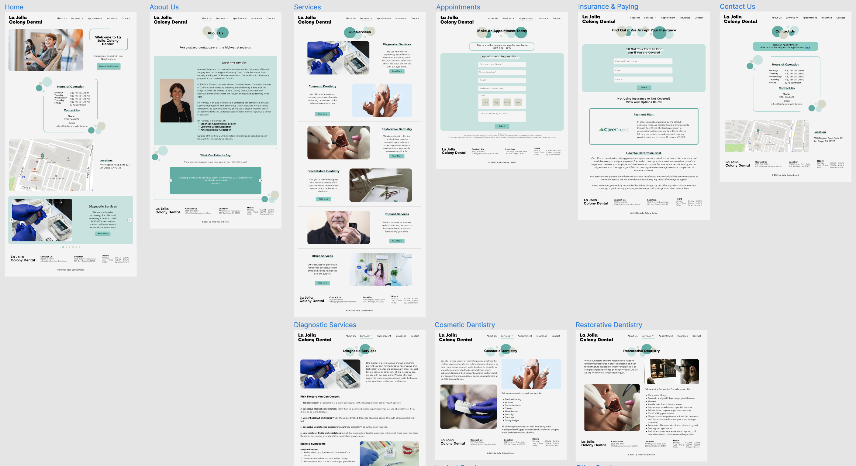
With these considerations, we finalized our style guide and color palette to convey tranquility, cleanliness, positivity, and hospitality.

Features, Functionality & Site Architecture
From there, we went on to design the site based off of both Dr. Florescu and her clients’ needs. The Information Architecture tells the story of how features and website layout come together.
Specific features that contribute to the values of informational, trustworthy and flexible include:
Informational
- The menu provides descriptive and straightforward links to every page.
- The homepage contains contact information with hours, locations, and phone numbers. These can also be found with more details on the Contact page.
Trustworthy
- The Services pages display information about each type of procedure that is offered and is more beneficial than a general information page.
- Providing testimonials helps new or returning patients evaluate trust.
Flexible
- Clients can fill out a form to request an appointment and be contacted later, rather than having to call during working hours.
- Clients can see if their insurance is accepted via a quick survey on the Insurance & Pricing page.
(This helps Dr. Florescu and clients because the list of insurance providers they take changes frequently, so using a survey widget to validate via a database is easier than hard coding the providers every time they change.)
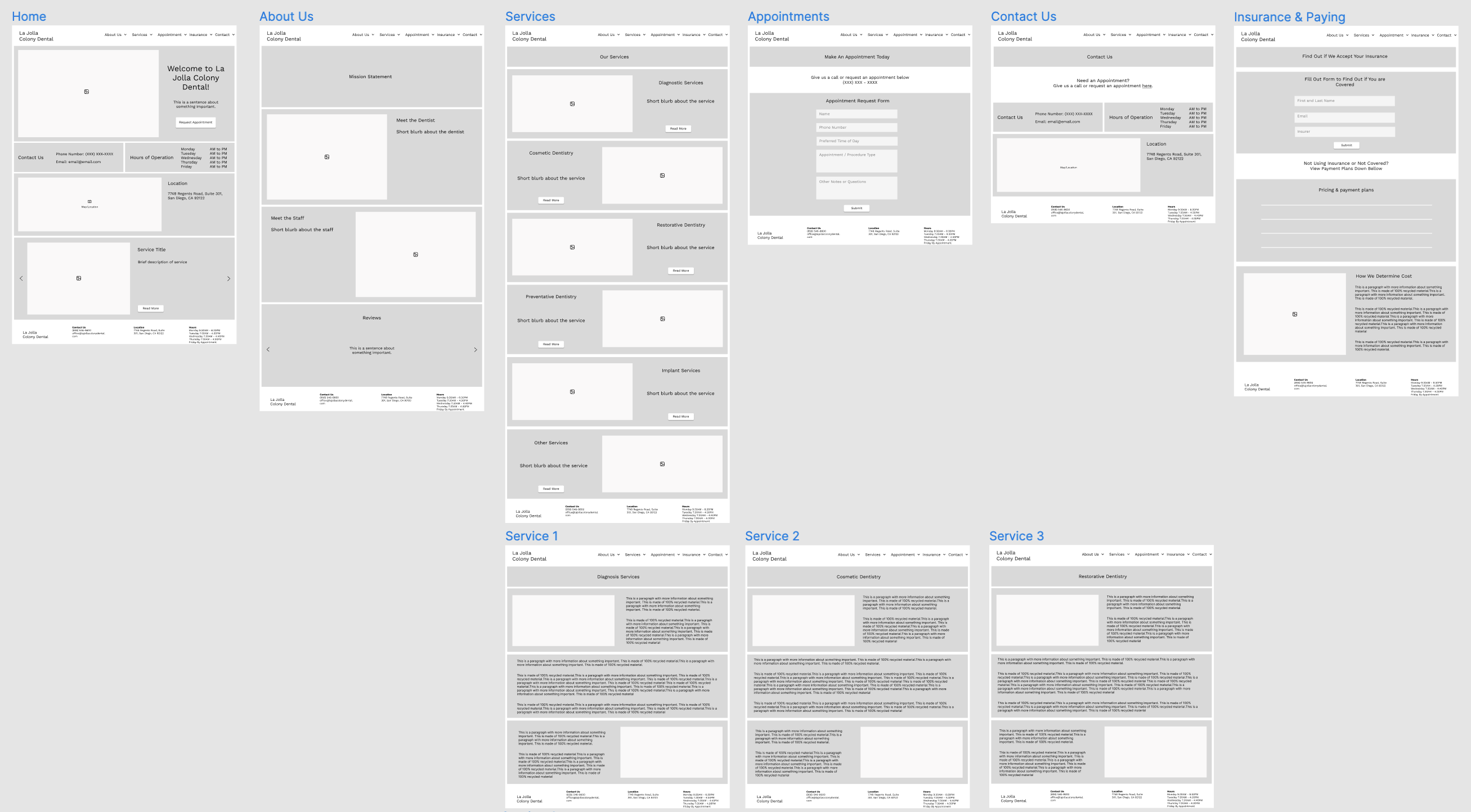
From Lo-fi to Hi-fi
Prototyping
To begin prototyping, we created wireframes & functional specifications for the site. We then began developing a low fidelity version of the site to iterate upon.
User Testing
We conducted a few rounds of user testing, bumping up the fidelity based on feedback from every round. We tested first, with one user using the prototype freely, then again with critique from a group of designers, and lastly, we guided our professor and Dr. Florescu (respectively) through the website.
We then made the following improvements based off of the following feedback:
- The website needs more clarity on why they should trust and feel safe with the doctor. Dentists are notoriously scary for many people, so users should feel the opposite on this site.
- Content FIX: Highlighting Dr. Florescu’s credentials and adjusting her mission statement to reflect that she provides quality care with kindness in mind.
- Visual FIX: Adjusting header fonts and softening edges on visuals to make the website cozier.
{“If I wanna work with this dentist … they are going to make me feel comfortable because I am looking at non-sharp edges” – User}
- Stock photos are not as trustworthy as photos taken. They also don’t correlate with the procedures that they are pictured with.
FIX: We changed a few of the stock photos to match the name of the service. We also removed some photos altogether because they did not further the purpose of the pages.
*Unfortunately, Dr. Florescu was not available enough to conduct a photoshoot, so stock photos were the only option.
- Too much overwhelming text on each Services screens, especially on mobile.
FIX: Revised and removed some unnecessary copy and changed font weight for paragraphs.
Overall, everyone who viewed and tested the website, especially Dr. Florescu, was happy with the flow and appearance.
“[The hours and location] is usually what patients look for first when looking at the website. It’s great that they’re all on the home page – it will make sense to the customers.”
– Dr. Florescu
The doctor specifically stated that she liked the homepage and contact page because they clearly stated her hours of operation and the location of the office. She also mentioned that having it on every page at the bottom (the footer) is a great addition as well.
Final Prototype
Click here to view our Figma Prototype.
*You can use the sidebar to see both the mobile and desktop versions of the website.*
Learning Outcomes
Dr. Florescu had a very hands-off approach to this website redesign. She claimed at the beginning of our work with her that she trusted our judgement in what was better for the site. This allowed us steer much of the creative direction, but sometimes made it hard for us to understand her perspective. Along with the fact that she was sometimes slow to respond to our inquiries for meetings, we sometimes had to move on with our own justifications for choices because she would rarely give us constructive feedback. We did our best to get more information and communicate needs with her, but could have set a more strict and professional precedent at our first meeting.
It is important that the client understands the time commitment it takes to work with designers. The designer should set expectations and ensure that the client understands every process along the way.
Thanks to Professor David Kirsh, and my teammates, Elizabeth Morgan, Kelly Nham & Saul Jimenez.
